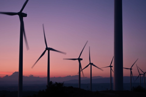
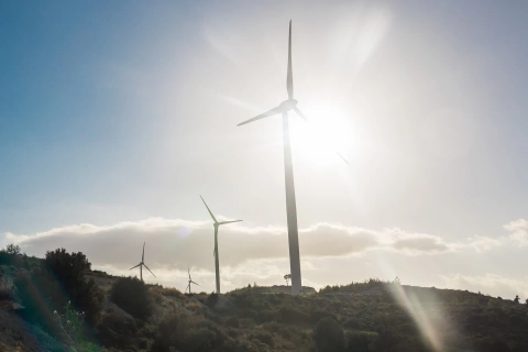
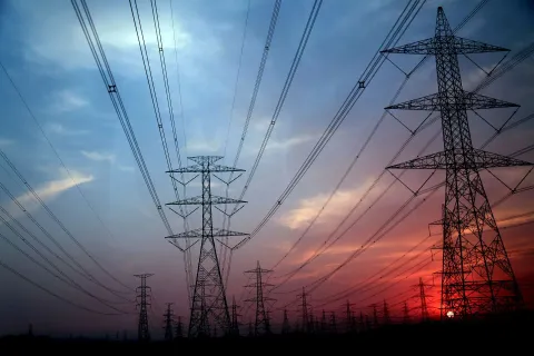
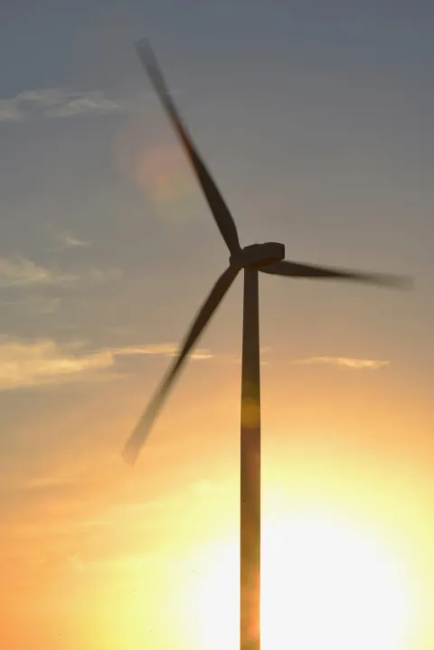
Contracts for Difference AR7: What We Know and What's Next
Cornwall Insight experts Tim Dixon, Lucy Dolton, and Robin Clarke discuss the recently published indicative timeline for the upcoming Contracts for Difference Allocation Round 7 auction.


Listen to the Energy Essentials Podcast
Listen NowFilter by country, topic or content type to find what you’re looking for
In June, the Climate Change Committee (CCC) published its “Progress in reducing emissions” report to Parliament. It highlighted, that with more action, the UK can still achieve its legally binding climate targets and improve energy security for households and businesses across the UK. However, a lot more action was needed.
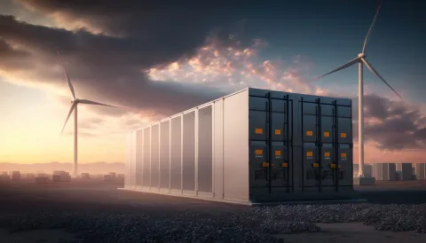
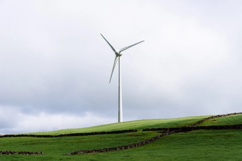
Read moreCornwall Insight experts Tim Dixon, Lucy Dolton, and Robin Clarke discuss the recently published indicative timeline for the upcoming Contracts for Difference Allocation Round 7 auction.
Read moreREGO prices have plummeted - but is this a short-term dip or a sign of deeper change? From record highs in 2023 to lows not seen since 2021, prices in the Renewable Energy Guarantees of Origin (REGO) market have shifted fast.
Read moreAt the start of May, the Ministry of Housing, Communities and Local Government published an impact assessment of the Planning and Infrastructure Bill. But will the Bill deliver on its promises? And what could it mean for businesses and households? We take a closer look at the detail.
Read moreFew topics have stirred as much debate in the GB energy sector as the question of whether the electricity market should shift from a national wholesale price to a zonal one. So, what’s the real story?
Read moreWe explore the practical challenges and potential timelines if zonal pricing is adopted, drawing on Cornwall Insight’s new Zonal GB Benchmark Power Curve, the paper examines the complexity of the reform looking at the key points on the way.
Read moreOur experts Tom Edwards and Dr. Craig Lowrey are joined by Peter Smith from National Energy Action to discuss the complexities of standing charges in energy bills
Read moreMeeting the UK’s targets of a clean power sector by 2030 and a net zero economy by 2050 will require a significant growth in intermittent renewable generation, and an accompanying increase in technologies that can provide system flexibility – of which batteries are a key component. Our latest blog explores the evolution of the GB battery revenue stack over the last few years and the key drivers behind this.
Read moreWe explore the scale of the challenge ahead and shine a light on the benefits that the electrification of heat and transport could provide to both the system and end-users
Read moreIn this blog we take a look at what TNUoS is, what the key issues facing generators are, and what is now being proposed to address them via a new code modification, CMP444.
Read moreIn this podcast we introduce the Battery Energy Storage Solutions (BESS) market in Ireland and Northern Ireland & discuss the key challenges facing it & how wider reforms of the Irish energy market might impact BESS assets
Read moreThis episode of our podcast brings together different consumer bodies to get their response on some of the aspects covered in some of the latest consultations
Read moreWith Donald Trump once again President of the United States of America, the global economy has an indication of the tone and direction of energy policy for the world's largest consumer of oil, and the second largest energy user and emitter after China, through to the end of the decade. But what could Trump's Presidency mean for U.S. and global energy?
Read moreThis question and answer blog explores the purpose, capacity, and implications of gas storage in GB while addressing the key question: should we be worried about running low?
Read moreWe uncover the powerful trends driving this shift and examine how they are likely to shape business energy needs in the future.
Read morePrincipal Consultant Kate Mulvany delves into the key proposals and the potential impacts on investors, consumers, and the broader energy system.
Read moreTo facilitate an ever-growing supply of intermittent renewable energy generation, there is a need for the Single Electricity Market (SEM) for Ireland and Northern Ireland to have robust System Services
Read moreWe look at the opportunities for businesses and optimisers that have been opened up by the implementation of Virtual Trading Party arrangements under P415
Read moreWe introduce CATOs and discuss how they fit into the wider grid connection reform programmes.
Read moreAnalysis from our new Business Energy Cost Forecast, discussing the key drivers and trends for business energy bills alongside the actions that organisations can take to help manage these costs
Read moreSenior Analyst Hattie Lunn, discusses how Ofgem is looking to revive consumer confidence in our energy suppliers to improve engagement
Read moreWe look into what we can expect from future LTDA auctions and the challenges impacting the growth of renewable generation in Japan.
Read moreIn September 2024, the National Energy System Operator (NESO) published their Winter Outlook discussing their forecasts for supply and demand in the gas and electricity markets this winter.
Read moreThe 30th October marked the new Government's first Budget, which outlines spending plans across the whole economy. It sets out a number of energy-related announcements
Read moreIn our latest blog, Prinicpal Consultant Dr Craig Lowrey examines what we can expect from an energy perspective in the 2024 budget.
Read moreAs the UK transitions to net zero the capacity of renewable generation and storage connected to the grid will need to significantly increase from the current volumes.
Read moreWe are excited to welcome James Babben from RWE. Building on our recent discussion about the Allocation Round 6 results of the Contracts for Difference scheme, James shares his expert insights as a renewable power developer.
Read moreIn our latest insight paper, Living the Hy Life: Assessing Low-Carbon Hydrogen Offtake in the UK, Cornwall Insight dives into the evolving role of low-carbon hydrogen.
Read moreResearch Analyst Jamie Maule is joined by our Senior Consultants Antony Badger and Jacob Briggs, as they discuss energy supply contracting for electric vehicle charge-point operators in the GB market
Read moreDelve into the Allocation Round 6 results of the Contracts for Difference scheme, how they impact national decarbonisation and net zero targets and what we can expect from future Allocation Rounds
Read moreIn our latest blog, Lead Regulatory Analyst Giles McNaught examines the potential impact of the Minimum Capital Requirement on the domestic supply market and the delicate balancing act the government and regulators must maintain to ensure healthy competition.
Read moreOur latest Insight paper examines four key questions to understand the future role of REGOs in corporate electricity procurement and emissions reporting.
Read moreIn this podcast, our experts discuss the drivers and trends behind these long-term costs as well as the impacts on corporate decarbonisation efforts.
Read moreOur research paper explores the value of smart and V2G electric vehicle (EV) charging within a flexible energy system in three snapshot years.
Read moreOur latest report discusses a series of actions that can be taken by the new government, industry bodies, and market participants to help regain and maintain momentum in the transition to net zero.
Read moreIn our latest blog, Senior Consultant James Cunningham sets out the challenges these costs pose for developing the renewable energy projects needed to reach net zero and what is currently being done to address these issues.
Read moreIn our latest blog we present an overview of this Framework and discuss what it means for electricity storage in Ireland going forward.
Read moreIreland has renewable electricity targets for 2030 set out in the Climate Action Plans since 2021 of 9GW of onshore wind, 5GW of offshore wind and 8GW of solar.
Read moreJoin Dr Matthew Chadwick, Emily Lewis, and Humaira Iqbal as they discuss what these changes could mean for corporates
Read moreIn today's world, consumers are increasingly worried about greenwashing, with many concerned about being misled by companies falsely claiming to be environmentally friendly
Read moreIn this episode of The Energy Essentials Podcast, our Research Analyst Jamie Maule is joined by Tom Andrews, Senior Consultant at Cornwall Insight
Read moreThis paper examines the impact of reallocating policy costs from domestic energy bills.
Read moreThe new government is wasting no time rolling out its ambitious plans for a net zero electricity system by 2030.
Read moreThe Labour Party has clinched victory in the general election, but what does this mean for UK energy policy?
Read moreCornwall Insight is updating its look continuing in our commitment to innovation, clarity, and excellence in the energy sector.
Read moreWith the election looming and the parties battling it out for Number 10, we’re casting our eyes on what lies in store in the wholesale energy markets following the election period, even before the victory celebrations have ended and new policy can be implemented.
Read moreOur paper highlights the changing economic environment, and suggests a range of measures to support British industry decarbonised operations.
Read moreThis summary report provides an overview of trends for the Japan Power Market out to 2050 using outputs from Cornwall Insight’s latest Benchmark Power Curve for the Japan Electricity Market.
Read moreOur experts are joined by Shulman Advisory as they discuss as they discuss how Japan is looking to achieve carbon neutrality by 2050 and what challenges the market is facing as they work towards their decarbonisation goals.
Read moreOur experts are joined by Shulman Advisory as they discuss an introduction to the Japanese energy market.
Read moreOur experts discuss expanding the Balancing Mechanism (BM) versus the Central Dispatch approach as part of REMA.
Read moreWe published our latest EVCA Index which considers these developments and how they affect the relative attractiveness of 15 European countries as they attempt to accelerate their EV transitions.
Read moreDiscussing the challenges and opportunities surrounding the development of long duration energy storage in Ireland's transition to net zero.
Read moreOur experts focus on the evolution of the Contracts for Difference (CfD) scheme as part of REMA.
Read moreThere has been much speculation in the energy industry over what reforms to household energy bills could potentially be introduced. With so many areas under review, we’ve put together an overview of some of the options available.
Read moreWe explore the current protections and future changes that are being introduced for the non-domestic market.
Read moreThis report seeks to assess the potential for Long Duration Energy Storage technologies (LDES) in Ireland.
Read moreOur experts discuss an overview of the REMA and give a synopsis on the second consultation.
Read moreWe look at if the business models used in countries with much more advanced heat networks can be applied in GB.
Read moreOur experts discuss an overview of the REMA and give a synopsis on the second consultation.
Read moreIn this blog, we look at our latest quarterly updates from our Benchmark Power Curves covering Great Britain, Australia, and more.
Read moreAs Ireland works towards achieving net zero by 2050, there is a pressing need to develop additional renewable energy capacity. Offshore wind is likely to be a particularly important sector and, thanks to Ireland’s large offshore exclusive economic zone, presents a valuable opportunity for the Irish economy. Cognisant of this opportunity, the Irish Government is targeting the deployment of 5GW offshore wind capacity by 2030.
Read moreSince publishing the previous iteration of the Low-carbon Hydrogen Policy Index in April 2023, the global hydrogen market has continued to grow and develop as both national governments and industry stakeholders have sought to expand the role of hydrogen in their decarbonisation plans.
Read moreThe new Very Fast FCAS markets have 3 more months in the books, and as they settle into a reasonably stable quarter, clearer trends have emerged. This release, we re-calibrate our FCAS market curve with the latest data, with an eye to the long term viability of these markets, as well as incorporating the latest supply and demand projections originating from the 2024 Draft ISP.
Read moreIn this piece, we will assess the schemes’ effectiveness by looking at subsequent market trends, contextualising the cost relative to government spend, and considering what happens next.
Read moreCornwall Insight Australia has released our latest NEM Benchmark power curve (NEM BPC) for Q1 2024 to our subscribers. Our latest data from our recent Australian NEM Benchmark Power Curve shows that policy settings and decarbonisation ambition is likely to lead to a temporary, but significant, increase in wholesale energy prices before the end of the decade.
Read moreIn this podcast, our experts discuss the opportunities and challenges being faced as we pursue the transition to a green economy in the UK.
Read moreIn this podcast our Lead Research Analyst, Kate Hill, is joined by Stephen Knight from Heat Trust and George Munson from Leeds City Council to discuss heat network zoning and the impact this might have on consumers and how this could deliver for consumers.
Read moreTwo years on from Russia’s invasion of Ukraine, our experts discuss how the invasion has shaped the UK energy sector and the ongoing impacts.
Read moreThe government has released the budget and reference prices, along with the auction parameters, for the upcoming Contract for Difference (CfD) Allocation Round 6 (AR6)
Read moreThis report, developed in partnership with Integrate to Zero, explores the highlights, insights, and themes that are characterising household flexibility markets around the world.
Read moreThis blog explores, how since Russia’s invasion of Ukraine, the UK’s and EU’s natural gas imports have transitioned away from Russian pipeline supplies and towards liquified natural gas (LNG); the short and long-term impacts on UK energy bills; and what issues lie ahead in the LNG transition.
Read moreIn this blog post, we explore the key insights from the report titled “Revenue Stacking for Flexibility: A Report for National Grid Electricity Distribution” and shed light on the opportunities and challenges/solutions that lie ahead for providers of distributed flexibility services to electricity network operators in Great Britain.
Read moreIn this insight paper, we discuss the demand and challenges accompanying Japan’s changing energy mix. Aiming to address whether, as the transition to net zero creates greater need and opportunities for faster dispatch electricity storage, could Japan represent an up-and-coming market for battery asset investors and developers?
Read moreWe believe learning curves or rates have two important functions in the GB energy market: informing bids in subsidy auctions and fundamental inputs into long-term capacity expansion models.
Read moreIn this insight paper, we discuss the opportunities and challenges accompanying Germany’s changing energy mix, from a reliance on fossil fuels to widespread electrification and the further development of low-carbon hydrogen.
Read moreWe have collated some predictions from across our knowledge base to provide a quick snapshot of what to look out for in the GB energy market in 2024.
Read moreThis report provides an annual overview of trends for the All-Ireland Power Market out to 2030 using outputs from Cornwall Insight’s latest forward curve for the All-Island (AI) Single Electricity Market (SEM) covering Northern Ireland and the Republic of Ireland.
Read moreThis report provides an annual overview of trends for the GB Power Market out to 2030 using outputs from Cornwall Insight’s latest Benchmark Power Curve (BPC) for the British Electricity Market covering England, Scotland and Wales. This publication is based on comprehensive market and asset-level power price modelling that delivers long-term power price forecasts, informed \[…\]
Read moreThis year saw a return to relative calmness after the energy shocks of last year, while governments are playing an increasing role as the rate of new renewable generation lags. Spot pricing was subdued compared to last year, with no significant unexpected outages that caused sustained price spikes. Higher levels of renewable generation, including burgeoning \[…\]
Read moreThe ISP also forecasts that greater flexible gas generation is needed From Cornwall Insight Australia’s Energy Market Alerts service Offshore wind officially appears in the draft 2024 ISP due to state-based offshore wind targets.
Read moreCornwall Insight Australia released the latest Frequency Control Ancillary Service (FCAS) price curves for Q4 2023\. The two new Very Fast FCAS markets have begun, and with this report, Cornwall Insight Australia explores how they’re evolving and what the future outlook of these markets holds. Detailing a full 20-year interval level price forecast across the \[…\]
Read moreFrom Cornwall Insight Australia’s NEM Market Analysis report This October saw a 12.6% reduction in total emissions (accounting for -1.18 Mt CO2-e reduction) as solar and wind generation has increased significantly. The reduction in emissions may continue with the arrival of Fly Creek and Rye Park wind farms expected soon in NSW. This emissions intensity \[…\]
Read moreCornwall Insight Australia recently launched our Marginal loss factor (MLF) curve subscription insight service. The MLF curve provides future projections of MLF throughout the NEM, allowing clients to be better informed of likely MLF trajectories for both current projects and be able to benchmark MLFs for projects under development. The MLF curve includes projections for \[…\]
Read moreCornwall Insight Australia has released our latest NEM Benchmark power curve (NEM BPC) for Q4 2023 to our subscribers. Our latest edition includes Marinus Link, ESSO constraints and other updates. We have released a free excerpt, which you can access below. The Federal Government has announced a partnership with the Marinus Link project, progressing the now \[…\]
Read moreElectricity non-commodity costs, also known as Third Party Charges (or TPCs), are faced by the vast majority of end consumers that use electricity. They represent a significant proportion of the energy bill for domestic, SME and large industrial user types; however, their applicability and scale can vary depending on the type of user
Read moreIn our recent insight paper Race to net zero: Rebuilding investor confidence in the UK”, published on 30 November, we discuss how increased macroeconomic pressures and rising international competition for capital have impacted the UK’s ability to secure investment in renewables and maintain momentum towards net zero. We also investigate both short- and long-term changes \[…\]
Read moreUnderstanding policy impact on the cost to the consumers of renewable development in Northern Ireland Cornwall Insight Ireland’s report for RenewableNI finds that appropriate support for renewable generation in Northern Ireland can be expected to reduce overall cost to consumer.
Read moreFrom Cornwall Insight Australia’s Energy Market Perspective Our quarterly Energy Market Perspective contains an analysis of indicative capacity at REZ zones throughout the NEM. The following assessment for NSW is from our latest edition. The strategic development of Renewable Energy Zones (REZs) in New South Wales (NSW) is currently focused on three key areas: Central \[…\]
Read moreFollowing the previous iteration of the EVCA Index, published in September 2023, the EV market has continued to grow across Europe. From October 2022 to October 2023, the EU, Norway, and the UK have seen a combined 29% year-on-year increase in battery electric vehicle (BEV) sales
Read moreIncreased macroeconomic pressures and rising international competition have left the UK at risk of falling behind in the race to attract investment in the net zero transition. In this paper, we examine these headwinds alongside a discussion of the short and long-term changes to the Contracts for Difference scheme
Read moreFrom Cornwall Insight Australia’s Energy Market Alerts service Last Friday, the Commonwealth announced a major boost to the Capacity Investment Scheme, with the scheme now expected to deliver 32GW (combination of 9GW firming capacity and 23GW renewable generation) – up from 6GW. Cornwall Insight Australia has released an Energy Market Alert on the updated scheme. \[…\]
Read moreOn 22 November, the Chancellor of the Exchequer, Jeremy Hunt, presented the government’s Autumn Statement 2023\. The Statement contained a variety of measures related to energy including: In an upcoming insight paper, we further discuss the potential impact of the Autumn Statement on the UK’s ability to attract investment in net zero. The paper also \[…\]
Read moreFrom Cornwall Insight Australia’s NEM Market Analysis report With over 700 GWh of rooftop PV added to the NEM since October last year, records were again set in NEM minimum demands along with a high instantaneous renewable penetration within the grid of 71.4%. Once again, the month’s main story was negatively priced intervals and the \[…\]
Read moreFrom Cornwall Insight Australia’s Energy Market Alerts service Energy laws have now been amended to incorporate an emissions reduction objective alongside the other objectives. The list of targets that the market bodies will need to consider is listed in a separately published Targets Statement. The targets currently listed cover both Federal and state governments
Read moreRecent events, from the worker strikes at the Chevron-owned Wheatstone LNG facility in Australia to the Israel-Hamas conflict, have highlighted the potential for disruption to energy exports. The Wheatstone and nearby Gorgon facilities account for \~5% of global LNG supplies
Read moreThe latest round of Capacity Market auctions is underway following the publication of the auction parameters on 18 July, with the prequalification window subsequently opening on 26 July. In this blog, we explore some of the changes made to the rules and regulations of the scheme ahead of this year’s auctions. Earlier this year, the \[…\]
Read moreLooking back on this year, one of the key themes that can be drawn out of the regulatory action taken by Ofgem is the focus on protecting the most vulnerable consumers. Whilst this has always been a priority for the regulator, being weaved into its statutory duties and the licences of all domestic suppliers
Read moreIn October, lamppost EV charging provider Ubitricity rolled out a new pricing structure, which included a higher p/kWh rate for peak times. In this blog, we will look at why Ubitricity has taken this step, and how other lamppost charge point operators are structuring their tariffs. How and why has Ubitricity changed its pricing? Ubitricity’s \[…\]
Read moreAs we look ahead to a second winter with heavily reduced levels of Russian pipeline gas being supplied to Europe, one of the key variables in the stability and security of European gas supplies and prices will be the supply of Liquified Natural Gas (LNG).
Read moreEach month we hold our Flexibility Forum covering the latest developments in the flexibility space in GB, providing an opportunity for forum members to keep up to date with the goings on across policy, regulation, and markets – in a space that is seemingly everchanging and rarely static. In this blog, we explore some of \[…\]
Read moreIn our ‘The VFF… Very Fast and Financially rewarding market so far’ Chart of the week, the two new contingency markets, the Very Fast raise contingency FCAS market and the Very Fast lower contingency FCAS, were analysed and demonstrated the high participation of big batteries along with VPPs and DERs.
Read moreCornwall Insight Australia has released our latest NEM Benchmark power curve (BPC) for Q3 2023 to our insight service subscribers. We have released a free excerpt, which you can access below. The future of the energy transition requires substantial new generation, which means increasing the size of the skilled workforce, speeding up the connections process, and \[…\]
Read moreCornwall Insight Australia released the latest Frequency Control Ancillary Service (FCAS) price curves for Q3 2023 on 21 September 2023\. Available to download is an excerpt reporting the headlining power price trends from the FCAS insight service. NEM FCAS markets in Q1 and Q2 of 2023 saw lower overall costs, with a lack of contingency \[…\]
Read moreAs the grid transitions to much higher levels of renewable penetration, the range of generation outcomes on any given day increases. The worst of these ranges are known as dark doldrums when there is a combination of poor conditions for wind and solar generation, usually a windless day in winter.
Read moreThis report focusses on the strategic measures that businesses can take to decarbonise their energy usage, with more practical measures discussed in our previous insight papers.
Read moreThis report explores the potential to enable the decarbonisation of the GB energy system and meeting net zero ambitions through evolutionary reforms to the transmission charging and constraint management arrangements. Cornwall Insight is an independent energy consultant with extensive experience in market and policy analysis.
Read moreThis report provides an annual overview of trends for the All-Ireland Power Market out to 2030 using outputs from Cornwall Insight’s latest forward curve for the All-Island (AI) Single Electricity Market (SEM) covering Northern Ireland and the Republic of Ireland.
Read moreThis report provides an annual overview of trends for the GB Power Market out to 2030 using outputs from Cornwall Insight’s latest Benchmark Power Curve (BPC) for the British Electricity Market covering England, Scotland and Wales. This publication is based on comprehensive market and asset-level power price modelling that delivers long-term power price forecasts, informed \[…\]
Read moreOn 9 October 2023, 1pm (market time), we saw the start of two new contingency FCAS markets. The Very fast raise contingency FCAS market, and the Very fast lower contingency FCAS. Upon commencement of the VF FCAS market, a commissioning period of two weeks with an initial max requirement of 50 MW for both Raise
Read moreThe Federal Government has legislated emissions reductions of 43% below 2005 levels by 2030\. Sourcing electricity from renewable technologies is fundamental to meeting this, with a much-publicised target of 82% renewables in the grid by 2030
Read moreThis report is an introduction to changes in the energy market. It has been written in a way that is easy to understand for people who are not familiar with the topics. Energy is critical to all sectors of the economy, and this report provides a high-level overview of the transformation options and policy decisions
Read moreThe past two years have seen rocketing energy prices, as households and businesses grapple with bills far beyond pre-crisis levels. There is no way to turn back the clock, however, we can look to seize the many opportunities to reshape and future-proof the UK energy system, ensuring a brighter future for consumers.
Read moreOn 9 October 2023, 1pm (market time), the dispatch of the new Very Fast (VF) FCAS market in the NEM will commence and will add two new markets for contingency FCAS, Raise 1 (R1) and Lower 1 (L1). AEMO has released a final industry go-live plan to keep track of activities before the eventual launch
Read moreSince the previous iteration of the EVCA Index, published in June 2023, there have been some changes to the electric vehicle (EV) landscape. The EV market has continued to grow with battery electric vehicle (BEVs) sales increasing across Europe. Cornwall Insight have partnered with law firm Shoosmiths to create the Electric Vehicle Country Attractiveness (EVCA) \[…\]
Read moreIn order for the UK to meet its commitment to a net zero economy by 2050, all sectors will be required to reduce their carbon emissions. In this paper, we set out some of the main options for decarbonising heat and power in the healthcare sector, and the typical advantages and disadvantages.
Read moreRenewable Energy Guarantees of Origin, more commonly referred to as REGOs, are certificates issued to accredited renewable generators for every MWh of electricity they produce over a year period. The initial intentions of these certificates were to provide suppliers a means to prove the level of renewable generation they received and to avoid the ‘double \[…\]
Read morePenetration of renewables continues to dominate the energy news, as we saw renewables as a proportion of total demand reach new heights this week to a new record of \~70% penetration. In light of this continuing march toward a renewable-dominated grid
Read moreA key part of the business case for grid-scale standalone batteries is the arbitrage opportunity between low daytime wholesale prices (when renewable energy generation from solar is plentiful) and high evening prices (when the sun goes down and household demand ramps up quickly).
Read moreMLF, short for Marginal Loss Factor, represents the portion of electricity losses that occur along the transmission network between a connection point and the Regional Reference Node (RRN). Within the NEM, the MLF serves as a metric to quantify these losses along the network, playing a pivotal role in determining market settlements
Read moreThe focus of batteries is constantly adjusting to reflect ‘where the money is at’. Various quarters have trends, and others have events that swing momentum. With FCAS enablement in Q2 this year dropping to some of the lowest values since 2016, shifting the solar curve, or rather arbitrage, became the biggest focus for storage assets.
Read moreLast year, we partnered together with Wind Energy Ireland (WEI) to produce a report titled Improving Revenue Certainty and Risk Allocation for New Renewable Generators”, which explored potential auction policy changes for the RESS auction that would help de-risk renewable investment for developers and generators
Read moreAcross the mainland states in the NEM, South Australia (SA) relies heavily on variable renewable energy (VRE) resources. SA is an excellent subject to test the premise What if the wind doesn’t blow, and the sun doesn’t shine”? Negative spot prices persist in South Australia due to an abundant supply from renewable generation
Read moreNew analysis from Cornwall Insight and Smart Energy GB has revealed the substantial cost-saving potential of household flexible electricity initiatives such as time-of-use tariffs, smart meters, solar PV, and batteries. The has data revealed national wholesale and system electricity costs could be cut by an annual £4.6bn in 2030 and £14.1 billion in 2040
Read moreOver the last five financial years, South Australia has seen a significant increase in price volatility, with substantial portions of time both negative and above $250/MWh, leading to increasing opportunities for storage systems to provide arbitrage services.
Read moreThe research underpinning this report aims to understand the financial and environmental benefits of household flexibility for consumers and the national energy system. We have analysed the difference between a scenario where households participate in flexibility, and one where they don’t.
Read moreOn 3 August, at the request of the Australian Energy Market Operator (AEMO), the Australian Energy Market Commission (AEMC) initiated a rule change request proposing to clarify the mandatory primary frequency response (PFR) obligations of scheduled bidirectional plant
Read moreOver the last week, a number of anticipated publications were issued by Ofgem that hold the potential to make a significant change to the requirements on both domestic and non-domestic suppliers. The findings of Ofgem’s non-domestic market review were revealed, alongside a policy consultation on the options available
Read moreThe Australia-Asia power line proposed by Sun Cable will connect a 17-20GW capacity solar plant to Darwin with an 800km High Voltage Direct Current (HVDC) transmission line, which then connects to Singapore via a 4,500km HVDC transmission subsea cable (Australia-Asia-powerlink).
Read moreAlthough not quite as thrilling for some as the search for the Holy Grail, finding a way to minimise causer pays costs continues to take the focus of both wind and solar farms. Using the FI value through self-forecast systems\[1\] has become increasingly prevalent for these assets in an effort to reduce the FCAS penalties \[…\]
Read moreWith the Default Tariff Cap falling by 17% compared to the Energy Price Guarantee (EPG) at the start of the month, there has been a great deal of attention around the possible return of fixed tariffs for domestic consumers. Several fixed tariffs were indeed launched in recent weeks, representing a first return to competition in \[…\]
Read moreThe Step Change scenario in the 2022 Integrated System Plan (ISP) is targeting 83% renewable energy generation in the NEM by 2030-31\. By then, around 79GW of VRE resources (wind, utility solar, and distributed PV) is expected to have been installed to help replace the 14GW capacity of synchronous generation withdrawn.
Read moreThis report provides an annual overview of trends for the GB Power Market out to 2030 using outputs from Cornwall Insight’s latest Benchmark Power Curve (BPC) for the British Electricity Market covering England, Scotland and Wales.
Read moreThis report provides an annual overview of trends for the All-Ireland Power Market out to 2030 using outputs from Cornwall Insight’s latest forward curve for the All-Island (AI) Single Electricity Market (SEM) covering Northern Ireland and the Republic of Ireland.
Read moreSince the previous iteration of the EVCA Index, published in March 2023, there have been some changes to the EV landscape. New countries have emerged as leaders in battery electric vehicle (BEV) growth while others have continued to develop their charging networks and maintain economic strength
Read moreAs the UK transitions towards net zero, the increasing share of the energy generation mix coming from renewables is resulting in greater intermittency of generation, leading to a growing system need for flexible dispatch solutions. Produced in conjunction with DLA Piper, this report provides a background to energy storage and considers the main revenue streams
Read moreUsing exclusive insights from our new North West Europe Benchmark Power Curve, our insight paper assesses the impact of the energy crisis on Germany’s net zero ambitions and attainment. Current and future policy decisions are unpacked and evaluated to determine their impact on the net zero investment landscape
Read moreJoin us for a podcast episode where we tackle the complicated seeming topic of constructing an electricity network that supports decarbonisation. Despite its complexities, the conversation is accessible and easy to follow. Guests, Frank Hodgson from REGEN and David Cowdrey from MCS Charitable Foundation, share opinions and findings from the research report Building a GB \[…\]
Read moreAnna Moss is joined by Cornwall Insight’s Jacob Briggs and Dan Hamza-Goodacre and Sophie Bordat from Integrate to Zero to talk about our recent research into the carbon and cost reduction opportunities from integrated energy in GB.
Read moreSoaring inflation and interest rates\*, combined with supply chain issues and labour shortages, have pushed up the cost of capital and increased the costs needed to finance renewable projects. With the latest round of the Contracts for Difference (CfD) scheme now ongoing
Read moreThough this is not the original intention of the REGO scheme, REGOs have increasingly become seen as a mechanism to provide support to increase the build-out of renewable generation in GB. This report therefore examines the question has trading in REGOs provided an effective incentive for investment in new renewable electricity generation in GB
Read moreData from Cornwall Insight’s Business Electricity Bill Forecast has shown businesses that fixed their energy contracts at the peak of the energy market last year, could be facing up to a 133% rise in bills from April
Read moreThe Irish electricity sector has undergone significant change in recent years. The Integrated Single Electricity Market (I-SEM) arrangements introduced in 2018 fundamentally transformed the market framework to maximise competition, facilitate electricity wholesale trading, and incentivise the development of low-carbon generation sources
Read moreSoaring energy prices and challenging macroeconomic conditions mean many businesses are struggling to maintain progress towards net zero. With increasing pressures from both consumers and investors for companies to decarbonise, the desire to progress to net zero remains for many businesses but financial pressures have forced plans to be pushed back.
Read moreSoaring inflation and interest rates, combined with supply chain issues and labour shortages, have pushed up the cost of capital and increased the costs needed to finance renewable projects. With the latest round of the Contracts for Difference (CfD) scheme set to open to applications this month many in the industry are concerned
Read moreThis report summarises the current market landscape, opportunities, and barriers to offering integrated energy propositions to consumers in Great Britain (GB).
Read moreIn December 2022, we published our insight paper, Another winter of discontent? What happens to the UK this winter, and next, if the gas taps from Russia stay turned off? discussing concerns for European and UK gas supply during winters 2022-23 and 2023-24, and the key variables that could influence gas storage levels
Read moreIn light of the financial pressures faced by enterprises from rising inflation and interest rates, tight supply chains and labour markets, alongside high energy bills, this paper investigates to what extent decarbonisation is still a priority for corporates and how progress towards net zero has been impacted by recent developments.
Read moreOur latest forecasts for the Default Tariff Cap (price cap) have shown energy bill predictions for a typical household have fallen to £3,208 from April
Read moreSmart meters have the potential to play a critical role in energy security, providing near real-time information through a visual in-home display, empowering consumers to change how much energy they use and when they use it. If consumers reduce or shift their energy consumption away from peak periods, they may be able to save money
Read moreSubstantial reductions in Russian gas supply to Europe and increased global competition for LNG cargoes have resulted in substantially elevated gas prices for the UK this winter (2022-23) compared to the historical norm.
Read moreThe RA held a stakeholder workshop on 23 November to provide an update on the next steps of the project following the publication of the decision paper on the System Services Future Arrangements High Level Design (SEM-22-012) in April 2022
Read moreHead of Relationship Development, Robert Buckley, joins us for the last part of our REMA event. Find out how we can help you navigate REMA here.
Read morePart 4 of our REMA event sees Head of Modelling, Sarah Johnston share her thoughts. Find out how we can help you navigate REMA here.
Read moreIn Part 3 of our REMA event, Senior Consultant, Kate Mulvany, talks about different options available for REMA. Find out how we can help you navigate REMA here.
Read moreIn Part 2 of our REMA event, Principal Consultant, Adam Boorman introduces REMA. Find out how we can help you navigate REMA here.
Read moreIn Part 1 of our event on REMA, Dr. Daniel Atzori introduces how the energy market has changed up until now, survey results from the industry on REMA and what our other experts will be speaking on. Find out how we can help you navigate REMA here.
Read moreRecent challenges have emphasised the recurring importance of the energy trilemma, namely the need to decarbonise the energy system while ensuring energy security and affordability. The government announced its Review of Electricity Market Arrangements (REMA) in April 2022 to address these issues.
Read moreMCS Charitable Foundation (MCS) in its charity goal of decarbonising homes, heat and energy has commissioned us to calculate the costs of blue and green hydrogen, based on current and projected gas prices. This report sets out our methodology for this forecast, and our findings in terms of delivered prices for green and blue hydrogen.
Read moreAmidst the proposals to help consumers with rising energy bills is one to incentivise investment in renewables. Earlier this week Rob Gross from UKERC, the originator of this Pot Zero” proposal, joined Tom Edwards and Robert Buckley to discuss it and wider prospects for the British energy sector.
Read moreJoe Camish joins Veronica Truman in our latest podcast. They talk about National Grid ESO’s early outlook for the coming winter season, the assumptions behind the modelling and the steps the ESO are taking to mitigate potential issues to European gas supplies this winter.
Read moreCompanies looking to decarbonise can consider on-site generation of low-carbon energy and the purchasing of low-carbon energy through a CPPA.
Read moreThe Market Stabilisation Charge (MSC) requires all domestic suppliers acquiring a customer to make a payment to the supplier that is losing the customer. The charge applies to all switches, so suppliers are not obliged to inform competitors which tariff the consumer switched to or from. It is comprised of two sub-charges; one for gas \[…\]
Read moreWith climate change high on the agenda, many countries are looking at decarbonising their electricity generation and incorporating more renewable generation into their electricity systems. This research snapshot focuses on energy market design in Great Britain (GB), Ireland and Australia, considering what is being done to adapt to the changing generation mix.
Read moreIreland has an ambitious vision to reach net zero by 2050, and decarbonising residential heating is a significant challenge. This report examines the potential for hydrogen-based heating solutions in decarbonising residential heating in Ireland.On comparing the various options of using hydrogen for domestic heating in Ireland, hydrogen blending in the gas network is likely the \[…\]
Read more
Fill in your details and we will get back to you as soon as possible with more information about our solutions.